Volatility as an asset class – replication of Doran (2020) and extension to a leveraged risk-parity portfolio

Introduction

This post is going to be a departure from the usual genomics tilt of this blog. I’ve recently been interested in the science (art?) of hedging a stock portfolio against market downturns. Hedging is difficult and involves the selection of the right asset class, right allocation (holding too much of the hedge and you under perform in all markets) and right time to remove the hedge (ideally at the bottom of a correction). If the VIX (CBOE Volatility Index) were directly investable, holding it as an asset in a portfolio would provide a significant edge. However, you cannot directly “buy” the VIX, and tradable VIX products (like VXX, UVXY, etc) have notable under performance when used as a hedge (Bašta and Molnár, 2019).

A paper by James Doran (2020) proposed that a portfolio of SPX options that is highly correlated to the VIX could be held as a long-term hedge. The portfolio buys an ITM-OTM put spread and sells an ATM-OTM call spread when the VIX is at normal values, and does not hedge when the VIX is above the mean plus one standard deviation. In this way the portfolio systematically removes the hedge when vol is the most expensive and therefore more likely to revert to the mean. For example, if SPX was at 3800 and VIX was at normal levels, the portfolio would allocate 1% to the following option spreads with one month expiration. The payoff with SPX at various levels at expiration is shown below.  Importantly, this spread has positive theta, and only begins to lose if SPX closes above 3850.

 ITM/OTM %Put/CallStrike
Buy5% ITMPut3990
Sell5% OTMPut3610
SellATMCall3800
Buy5% OTMCall3990

P/L of the option spread at expiration. Cost = 8710, max gain = 29290, max loss = 27710.

I was interested in replicating the results of this paper, extending the findings to the end of 2020 (the paper stops in 2017), and finding if the option portfolio would hedge a leveraged stock portfolio holding UPRO (3X leveraged S&P500).

Step 0: Obtain data, write backtest code

Option data: I obtained end of day option prices for the SPX index from Stanford’s subscription to OptionMetrics for 1996-2019. 2020 data were purchased from historicaloptiondata.com.

Extended UPRO and TMF data: These products began trading in 2009, but we definitely want to include the early 2000s dotcom crash and 2008 financial crisis in our backtests. Someone on the bogleheads forum simulated the funds going back to 1986, and they’re available here

Backtesting: I wrote a simple program to backtest an option portfolio in R. This program buys a 30 DTE spread as described above and typically holds to expiration. When VIX is low, a fixed percentage of the portfolio value is placed into the option portion during each rebalance, which occurs when the options expire. When VIX is high (above mean plus one standard deviation), the portfolio only holds the base asset class. If VIX transitions from low to high, the hedge is immediately abandoned, and if VIX transitions from high to low, the hedge is repurchased.

Step 1: replicate the results of Doran (2020) with the SPX index

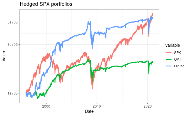
To ensure our option backtest works as expected, I first replicated the results from the Doran paper using the SPX index. I allocated a fixed 5% to the hedge. I found performance was improved by using options 10% ITM or OTM, so these were used in all backtests. Below are the returns of these portfolios from 1996-2020, starting with $100,000. Although the hedge does well in negative markets, the under performance in the bull market of the last 10 years is quite apparent. The hedge also didn’t protect much against the rapid COVID crash in March 2020 – I think because VIX spiked very quickly and the portfolio wasn’t hedged for much of the crash. My results don’t exactly match those in the paper (even using a 5% spread width). I think differences in the option prices, especially early in the dataset, are playing a role in this.

Equity curves for option hedged SPX portfolios. SPX = un-hedged. OPT: always hedged 5%. OPTsd: hedged 5% when VIX is below the mean plus one standard deviation.

 SPXOPTOPTsd
CAGR7.492.917.08
Sharpe ratio (Annualized)0.480.390.64
StdDev (Annualized)15.37.7111.23
Worst drawdown52.535.241.2

Step 2: extend the option hedge to a portfolio holding UPRO

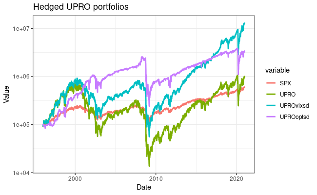
How does the hedge work using 3X leveraged fund UPRO? I conducted the same backtest, and found that 10% allocated to the hedge is better. This makes sense – you need something with higher volatility to balance out the extreme swings in UPRO. Hedged performance is definitely better than holding UPRO alone, which has pathetic stats over this time period. Better returns than holding SPX alone, but more variance and a equivalent Sharpe ratio. Holding the VIX as an asset is still the winner here.

Equity curves for option hedged UPRO portfolios. SPX: un-hedged, UPRO: un-hedged, UPROvixsd: holding VIX as hedge when VIX is low, UPROoptsd: holding option hedge when VIX is low.

 SPXUPROUPROoptsdUPROvixsd
CAGR7.499.7115.121.6
Sharpe ratio (Annualized)0.480.200.490.53
StdDev (Annualized)15.346.831.640.5
Worst drawdown52.597.487.791.7

Comparison to a UPRO/TMF portfolio

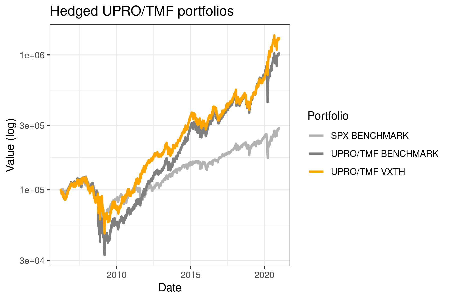
The option-hedged portfolio needs to outperform a 55/45% UPRO/TMF portfolio for me to consider running it for real. I used portfoliovisualizer.com to easily compare these portfolios with monthly rebalancing.

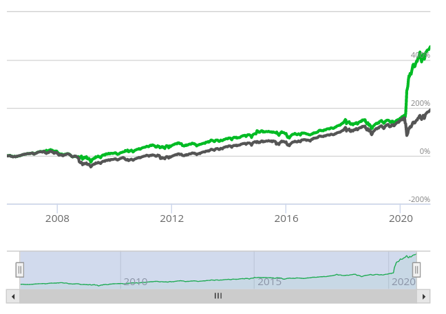
Portfolio 1 (blue) : UPROoptsd   Portfolio 2 (red) : UPRO/TMF 55/45   Portfolio 3 (yellow): UPRO/VIX 70/30

The returns with TMF have less variance than the option hedged portfolio and end up almost exactly equal at the end of this time period. However, in 1996-2008, the option portfolio definitely outperformed. Holding VIX is again the clear winner in both absolute and risk-adjusted returns, but still suffers severe drawdowns.

Conclusions

I don’t think holding this portfolio will provide a significant advantage compared to a UPRO/TMF portfolio. Given the limitations below and no significant advantage in the backtest, I won’t be voting with my wallet. The option hedge portfolio did provide significant advantages in the 1996-2008 period, where it outperformed all other portfolios (even the optimal 70/30 UPRO/VIX!) with a Sharpe ratio of 1.01 and max drawdown of 47% in the dotcom crash. I may paper-trade this strategy to get a feel for position sizing, slippage and fills on these spreads, though.

Limitations: Why I won’t be hedging with this method

  1. This model assumes all transactions occur at the midpoint of the bid-ask spread and does not take into account transaction costs. While transaction costs are relatively small, SPX and XSP can have relatively wide bid-ask spreads, much wider than SPY.
  2. Options can by illiquid, only purchased in fixed quantities, and difficult to adjust. Today with SPX at 3750, Buying one SPX 30d 5% ITM-OTM put spread costs $16100. Adding the call spread brings the cost down to $9340 but brings the max loss of the position to $27340! Trading on XSP brings the cost down by a factor of 10. With a 1% hedge, this method is only good for portfolios >100k. As a 5% hedge this can be used on a portfolio as small as 20k. Still, what do you do when the optimal amount of hedge is 1.5 XSP contracts?
  3. It’s more complicated than simply rebalancing between UPRO and TMF, requiring more active management time.
  4. The option hedge didn’t even outperform UPRO/TMF in some regards!
  5. Backtests are only backward-looking and easy to overfit to your problem.

Future directions to explore

  1. Optimal hedge amount – was not optimized scientifically, I just tried a few values and decided based on returns and Sharpe ratio.
  2. Differing DTE on position opening an closing. 30 days and holding to expiration may not be optimal.
  3. Selecting strikes based on Delta instead of fixed percentage ITM/OTM. This would result in different strikes selected in times of low and high vol, but probably has a minimal impact.
  4. The max loss of these spreads can be quite high compared to the cost to enter the trade – maybe the hedge amount should be scaled based on the max loss of the position (with the remaining invested in the base asset or held in cash).

Questions? Other ideas to test? Let me know! I’ll also happily release returns or code (it’s not pretty) if you are interested.

References:
1.Doran, J. S. Volatility as an asset class: Holding VIX in a portfolio. Journal of Futures Markets 40, 841–859 (2020).
2.Ayres, I. & Nalebuff, B. J. Life-Cycle Investing and Leverage: Buying Stock on Margin Can Reduce Retirement Risk. https://papers.ssrn.com/abstract=1149340 (2008).
3.Ayres, I. & Nalebuff, B. J. Diversification Across Time. https://papers.ssrn.com/abstract=1687272 (2010).
4. Bašta, M. & Molnár, P. Long-term dynamics of the VIX index and its tradable counterpart VXX. Journal of Futures Markets 39, 322–341 (2019).

Leveraged portfolio background

The leveraged portfolio idea comes from the famous “HEDGEFUNDIE’s excellent adventure” thread on the Bogleheads forum (thread 1, thread 2) with ideas going back to “lifecycle investing” and “diversification across time” from Ayres and Nalebuff (2008, 2010). Basically, it makes sense to use leverage to obtain higher investment returns when you’re young and expect to have higher earnings in the future. You can do this with margin, futures, LEAPS options, or leveraged index funds. The leveraged funds appear to be the easiest way to obtain consistent and cheap leverage without risk of a margin call. The portfolio holds 55% UPRO and 45% TMF (3X bonds) and typically rebalances monthly. I’ve also thrown some TQQQ (3X leveraged NASDAQ) into the mix. These portfolios outperform a 100% stocks or an unleveraged 60/40 portfolio on BOTH a absolute and risk-adjusted return basis. However, if you could hold VIX as an asset to rebalance out of, performance would be even better. Hence my interest in replicating the a VIX hedge with options.

Large-scale bioinformatics in the cloud with GCP, Kubernetes and Snakemake

I recently finished a large metagenomics sequencing experiment – 96 10X Genomics linked read libraries sequenced across 25 lanes on a HiSeq4000. This was around 2TB of raw data (compressed fastqs). I’ll go into more detail about the project and data in another post, but here I’m just going to talk about processing the raw data.

We’re lucky to have a large compute cluster at Stanford for our every day work. This is shared with other labs and has a priority system for managing compute resouces. It’s fine for most tasks, but not up to the scope of this current project. 2TB of raw data may not be “big” in the scale of what places like the Broad deal with on a daily basis, but it’s definitely the largest single sequencing experiment I and our lab has done. To solve this, we had to move… TO THE CLOUD!

By utilizing cloud compute, I can easily scale the compute resources to the problem at hand. Total cost is the same if you use 1 cpu for 100 hours or 100 cpus for 1 hour… so I will parallelize this as much as possible to minimize the time taken to process the data. We use Google Cloud Comptue (GCP) for bioinformatics, but you can do something similar with Amazon’s or Microsoft’s cloud compute, too. I used ideas from this blog post to port the Bhatt lab metagenomics workflows to GCP.

Step 0: Install the GCP SDK, Configure a storage bucket.

Install the GCP SDK to manage your instances and connect to them from the command line. Create a storage bucket for data from this project – this can be done from the GCP console on the web. Then, set up authentication as described here.

Step 1: Download the raw data

Our sequencing provider provides raw data via an FTP server. I downloaded all the data from the FTP server and uploaded it to the storage bucket using the gsutil rsync command. Note that any reference databases (human genome for removing human reads, for example) need to be in the cloud too.

Step 2: Configure your workflow.

I’m going to assume you already have a snakemake workflow that works with local compute. Here, I’ll show how to transform it to work with cloud compute. I’ll use the workflow to run the 10X Genomics longranger basic program and deinterleave reads as an example. This takes in a number of samples with forward and reverse paired end reads, and outputs the processed reads as gzipped files.

The first lines import the cloud compute packages, define your storage bucket, and search for all samples matching a specific name on the cloud.

from os.path import join
from snakemake.remote.GS import RemoteProvider as GSRemoteProvider
GS = GSRemoteProvider()
GS_PREFIX = "YOUR_BUCKET_HERE"
samples, *_ = GS.glob_wildcards(GS_PREFIX + '/raw_data_renamed/{sample}_S1_L001_R1_001.fastq.gz')
print(samples)

The rest of the workflow just has a few modifications. Note that Snakemake automatically takes care of remote input and output file locations. However, you need to add the ‘GS_PREFIX’ when specifying folders as parameters. Also, if output files aren’t explicitly specified, they don’t get uploaded to remote storage. Note the use of a singularity image for the longranger rule, which automatically gets pulled on the compute node and has the longranger program in it. pigz isn’t available on the cloud compute nodes by default, so the deinterleave rule has a simple conda environment that specifies installing pigz. The full pipeline (and others) can be found at the Bhatt lab github.

rule all:
    input:
        expand('barcoded_fastq_deinterleaved/{sample}_1.fq.gz', sample=samples)

rule longranger:
    input: 
        r1 = 'raw_data_renamed/{sample}_S1_L001_R1_001.fastq.gz',
        r2 = 'raw_data_renamed/{sample}_S1_L001_R2_001.fastq.gz'
    output: 'barcoded_fastq/{sample}_barcoded.fastq.gz'
    singularity: "docker://biocontainers/longranger:v2.2.2_cv2"
    threads: 15
    resources:
        mem=30,
        time=12
    params:
        fq_dir = join(GS_PREFIX, 'raw_data_renamed'),
        outdir = join(GS_PREFIX, '{sample}'),
    shell: """
        longranger basic --fastqs {params.fq_dir} --id {wildcards.sample} \
            --sample {wildcards.sample} --disable-ui --localcores={threads}
        mv {wildcards.sample}/outs/barcoded.fastq.gz {output}
    """

rule deinterleave:
    input:
        rules.longranger.output
    output:
        r1 = 'barcoded_fastq_deinterleaved/{sample}_1.fq.gz',
        r2 = 'barcoded_fastq_deinterleaved/{sample}_2.fq.gz'
    conda: "envs/pigz.yaml"
    threads: 7
    resources: 
        mem=8,
        time=12
    shell: """
        # code inspired by https://gist.github.com/3521724
        zcat {input} | paste - - - - - - - -  | tee >(cut -f 1-4 | tr "\t" "\n" |
            pigz --best --processes {threads} > {output.r1}) | \
            cut -f 5-8 | tr "\t" "\n" | pigz --best --processes {threads} > {output.r2}
    """

Now that the input files and workflow are ready to go, we need to set up our compute cluster. Here I use a Kubernetes cluster which has several attractive features, such as autoscaling of compute resources to demand.

A few points of terminology that will be useful:

  • A cluster contains (potentially multiple) node pools.
  • A node pool contains multiple nodes of the same type
  • A node is the basic compute unit, that can contain multiple cpus
  • A pod (as in a pod of whales) is the unit or job of deployed compute on a node

To start a cluster, run a command like this. Change the parameters to the type of machine that you need. The last line gets credentials for job submission. This starts with a single node, and enables autoscaling up to 96 nodes.

export CLUSTER_NAME="snakemake-cluster-big"
export ZONE="us-west1-b"
gcloud container clusters create $CLUSTER_NAME \
    --zone=$ZONE --num-nodes=1 \
    --machine-type="n1-standard-8" \
    --scopes storage-rw \
    --image-type=UBUNTU \
    --disk-size=500GB \
    --enable-autoscaling \
    --max-nodes=96 \
    --min-nodes=0
gcloud container clusters get-credentials --zone=$ZONE $CLUSTER_NAME

For jobs with different compute needs, you can add a new node pool like so. I used two different node pools, with 8 core nodes for preprocessing the sequencing data and aligning against the human genome, and 16 core nodes for assembly. You could also create additional high memory pools, GPU pools, etc depending on your needs. Ensure new node pools are set with --scopes storage-rw to allow writing to buckets!

gcloud container node-pools create pool2 \
    --cluster $CLUSTER_NAME \
    --zone=$ZONE --num-nodes=1 \
    --machine-type="n1-standard-16" \
    --scopes storage-rw \
    --image-type=UBUNTU \
    --disk-size=500GB \
    --enable-autoscaling \
    --max-nodes=96 \
    --min-nodes=0

When you are finished with the workflow, shut down the cluster with this command. Or let autoscaling slowly move the number of machines down to zero.

gcloud container clusters delete --zone $ZONE $CLUSTER_NAME

To run the snakemake pipeline and submit jobs to the Kubernetes cluster, use a command like this:

snakemake -s 10x_longranger.snakefile --default-remote-provider GS \
    --default-remote-prefix YOUR_BUCKET_HERE --use-singularity \
    -j 99999 --use-conda --nolock --kubernetes

Add the name of your bucket prefix. The ‘-j’ here allows (mostly) unlimited jobs to be scheduled simultaneously.

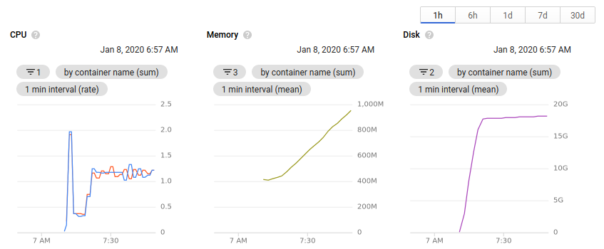
Each job will be assigned to a node with available resources. You can monitor the progress and logs with the commands shown as output. Kubernetes autoscaling takes care of provisioning new nodes when more capacity is needed, and removes nodes from the pool when they’re not needed any more. There is some lag for removing nodes, so beware of the extra costs.

While the cluster is running, you can view the number of nodes allocated and the available resources all within the browser. Clicking on an individual node or pod will give an overview of the resource usage over time.

Useful things I learned while working on this project

  • Use docker and singularity images where possible. In cases where multiple tools were needed, a simple conda environment does the trick.
  • The container image type must be set to Ubuntu (see above) for singularity images to correctly work on the cluster.
  • It’s important to define memory requirements much more rigorously when working on the cloud. Compared to our local cluster, standard GCP nodes have much less memory. I had to go through each pipeline and define an appropriate amount of memory for each job, otherwise they wouldn’t schedule from Kubernetes, or would be killed when they exceeded the limit.
  • You can only reliably use n-1 cores on each node in a Kubernetes cluster. There’s always some processes running on a node in the background, and Kubernetes will not scale an excess of 100% cpu. The threads parameter in snakemake is an integer. Combine these two things and you can only really use 7 cores on an 8-core machine. If anyone has a way around this, please let me know!
  • When defining input and output files, you need to be much more specific. When working on the cluster, I would just specify a single output file out of many for a program, and could trust that the others would be there when I needed them. But when working with remote files, the outputs need to be specified explicitly to get uploaded to the bucket. Maybe this could be fixed with a call to directory() in the output files, but I haven’t tried that yet.
  • Snakemake automatically takes care of remote files in inputs and outputs, but paths specified in the params: section do not automatically get converted. I use paths here for specifying an output directory when a program asks for it. You need to add the GS_PREFIX to paths to ensure they’re remote. Again, might be fixed with a directory() call in the output files.
  • I haven’t been able to get configuration yaml files to work well in the cloud. I’ve just been specifying configuration parameters in the snakefile or on the command line.

Transmission of crAsspahge in the microbiome

Update! This work has been published in Nature Communications.
Siranosian, B.A., Tamburini, F.B., Sherlock, G. et al. Acquisition, transmission and strain diversity of human gut-colonizing crAss-like phages. Nat Commun 11, 280 (2020). https://doi.org/10.1038/s41467-019-14103-3

Big questions in the microbiome field surround the topic of microbiome acquisition. Where do we get our first microbes from? What determines the microbes that colonize our guts form birth, and how do they change over time? What short and long term impacts do these microbes have on the immune system, allergies or diseases? What impact do delivery mode and breastfeeding have on the infant microbiome?

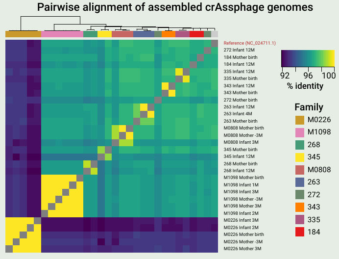
A key finding from the work was that mothers and infants often share identical or nearly identical crAssphage sequences, suggesting direct vertical transmission. Also, I love heatmaps.

As you might expect, a major source for microbes colonizing the infant gut is immediate family members, and the mother is thought to be the major source. Thanks to foundational studies by Bäckhed, Feretti, Yassour and others (references below), we now know that infants often acquire the primary bacterial strain from the mother’s microbiome. These microbes can have beneficial capabilities for the infant, such as the ability to digest human milk oligosaccharides, a key source of nutrients in breast milk.

The microbiome isn’t just bacteria – phages (along with fungi and archaea to a smaller extent) play key roles. Phages are viruses that predate on bacteria, depleting certain populations and exchanging genes among the bacteria they infect. Interestingly, phages were previously shown to display different inheritance patterns than bacteria, remaining individual-specific between family members and even twins (Reyes et al. 2010). CrAss-like phages are the most prevalent and abundant group of phages colonizing the human gut, and our lab was interested in the inheritance patterns of these phages.

We examined publicly available shotgun gut metagenomic datasets from two studies (Yassour et al. 2018, Bäckhed et al. 2015), containing 134 mother-infant pairs sampled extensively through the first year of life. In contrast to what has been observed for other members of the gut virome, we observed many putative transmission events of a crAss-like phage from mother to infant. The key takeaways from our research are summarized below. You can also refer my poster from the Cold Spring Harbor Microbiome meeting for the figures supporting these points. We hope to have a new preprint (and hopefully a publication) on this research out soon!

  1. CrAssphage is not detected in infant microbiomes at birth, increases in prevalence with age, but doesn’t reach the level of adults by 12 months of age.
  2. Mothers and infants share nearly identical crAssphage genomes in 40% of cases, suggesting vertical transmission.
  3. Infants have reduced crAssphage strain diversity and typically acquire the mother’s dominant strain upon transmission.
  4. Strain diversity is mostly the result of neutral genetic variation, but infants have more nonsynonymous multiallelic sites than mothers.
  5. Strain diversity varies across the genome, and tail fiber genes are enriched for strain diversity with nonsynonymous variants.
  6. These findings extend to crAss-like phages. Vaginally born infants are more likely to have crAss-lke phages than those born via C-section.

References
1. Reyes, A. et al. Viruses in the faecal microbiota of monozygotic twins and their mothers. Nature 466, 334–338 (2010).
2. Yassour, M. et al. Strain-Level Analysis of Mother-to-Child Bacterial Transmission during the First Few Months of Life. Cell Host & Microbe 24, 146-154.e4 (2018).
3. Bäckhed, F. et al. Dynamics and Stabilization of the Human Gut Microbiome during the First Year of Life. Cell Host & Microbe 17, 690–703 (2015).
4. Ferretti, P. et al. Mother-to-Infant Microbial Transmission from Different Body Sites Shapes the Developing Infant Gut Microbiome. Cell Host & Microbe 24, 133-145.e5 (2018).

What is crAssphage?

CrAssphage is a like mystery novel full of surprises. First described in 2014 by Dutilh et al., crAssphage acquired it’s (rather unfortunate, given that it colonizes the human intestine) name from the “Cross-Assembly” bioinformatics method used to characterize it. CrAssphage interests me because it’s prevalent in up to 70% of human gut microbiomes, and can make up the majority of viral sequencing reads in a metagenomics experiment. This makes it the most successful single entity colonizing human microbiomes. However, no health impacts have been demonstrated from having crAssphage in your gut – several studies (Edwards et al. 2019) have turned up negative.

Electron micrograph of a representative crAssphage, from Shkoporov et al. (2018). This phage is a member of the Podoviridae family and infects Bacteroides Intestinalis.

CrAssphage was always suspected to predate on species of the Bacteroides genus based on evidence from abundance correlation and CRISPR spacers. However, the phage proved difficult to isolate and culture. It wasn’t until recently that a crAssphage was confirmed to infect Bacteroides intestinalis (Shakoporov et al. 2018). They also got a great TEM image of the phage! With crAssphage successfully cultured in the lab, scientists have begun to answer fundamental questions about its biology. The phage appears to have a narrow host range, infecting a single B. intestinalis strain and not others or other species. The life cycle of the phage was puzzling:

“We can conclude that the virus probably causes a successful lytic infection with a size of progeny per capita higher than 2.5 in a subset of infected cells (giving rise to a false overall burst size of ~2.5), and also enters an alternative interaction (pseudolysogeny, dormant, carrier state, etc.) with some or all of the remaining cells. Overall, this allows both bacteriophage and host to co-exist in a stable interaction over prolonged passages. The nature of this interaction warrants further investigation.” (Shakoporov et al. 2018)

Further investigation showed that crAssphage is one member of an extensive family of “crAss-like” phages colonizing the human gut. Guerin et al. (2018) proposed a classification system for these phages, which contains 4 subfamilies (Alpha, Beta, Delta and Gamma) and 10 clusters. The first described “prototypical crAssphage” belongs to the Alpha subfamily, cluster 1. It struck me how diverse these phages are – different families are less than 20% identical at the protein level! When all crAss-like phages are considered, it’s estimated that up to 100% of individuals cary at least one crAss-like phage, and most people cary more than one.

Given the high prevalence of crAss-like phages and their specificity for the human gut, they do have an interesting use as a tracking device for human sewage. DNA from crAss-like phages can be used to track waste contamination into water, for example (Stachler et al. 2018). In a similar vein, our lab has used crAss-like phages to better understand how microbes are transmitted from mothers to newborn infants. The small genome sizes (around 100kb) and high prevalence/abundance make these phages good tools for doing strain-resolved metagenomics. Trust me, you’d much rather do genomic assembly and variant calling on a 100kb phage genome than a 3Mb bacterial genome!

Research into crAss-like phages is just beginning, and I’m excited to see what’s uncovered in the future. What are the hosts of the various phage clusters? How do these phages influence gut bacterial communities? Do crAss-like phages exclude other closely related phages from colonizing their niches, leading to the low strain diversity we observe? Can crAss-like phgaes be used to engineer bacteria in the microbiome, delivering precise genetic payloads? This final question in the most interesting to me, given that crAss-like phages seem relatively benign to humans, yet incredibly capable of infecting our microbes.

References
1.Dutilh, B. E. et al. A highly abundant bacteriophage discovered in the unknown sequences of human faecal metagenomes. Nature Communications 5, 4498 (2014).
2.Edwards, R. A. et al. Global phylogeography and ancient evolution of the widespread human gut virus crAssphage. Nature Microbiology 1 (2019). doi:10.1038/s41564-019-0494-6
3.Guerin, E. et al. Biology and Taxonomy of crAss-like Bacteriophages, the Most Abundant Virus in the Human Gut. Cell Host & Microbe 0, (2018).
4.Shkoporov, A. N. et al. ΦCrAss001 represents the most abundant bacteriophage family in the human gut and infects Bacteroides intestinalis. Nature Communications 9, 4781 (2018).
5.Stachler, E., Akyon, B., de Carvalho, N. A., Ference, C. & Bibby, K. Correlation of crAssphage qPCR Markers with Culturable and Molecular Indicators of Human Fecal Pollution in an Impacted Urban Watershed. Environ. Sci. Technol. 52, 7505–7512 (2018).

Metagenome Assembled Genomes enhance short read classification

In the microbiome field we struggle with the fact that reference databases are (sometimes woefully) incomplete. Many gut microbes are difficult to isolate and culture in the lab or simply haven’t been sampled frequently enough for us to study. The problem is especially bad when studying microbiome samples from non-Western individuals.

To subvert the difficulty in culturing new organisms, researchers try to create new reference genomes directly from metagenomic samples. This typically uses metagenomic assembly and binning. Although you most likely end up with a sequence that isn’t entirely representative of the organism, these Metagenome Assembled Genomes (MAGs) are a good place to start. They provide new reference genomes for classification and association testing, and start to explain what’s in the microbial “dark matter” from a metagenomic sample.

2019 has been a good year for MAGs. Three high profile papers highlighting MAG collections were published in the last few months[1,2,3]. The main idea in each of them was similar – gather a ton of microbiome data, assemble and bin contigs, filter for quality and undiscovered genomes, do some analysis of the results. My main complaint about all three papers is that they use reduced quality metrics, not following the standards set in Bowers et al. (2017). They rarely find 16S rRNA sequences in genomes called “high quality,” for example.

Comparing the datasets, methods, and results from the three MAG studies. This table was compiled by Yiran Liu during her Bhatt lab rotation.

After reading the three MAG papers, Nayfach et al. (2019) is my favortie. His paper does the most analysis into what these new genomes _mean_, including a great finding presented in Figure 4. These new references assembled from metagenomes can help explain why previous studies looking for associations between the microbiome and disease have come up negative. This can also help explain why microbiome studies have been difficult to replicate. If a significant association is hiding in these previously unclassified genomes, a false positive association could easily look significant because everything is tested with relative abundance.

In the Bhatt lab, we were interested in using these new MAG databases to improve classification rates in some samples from South African individuals. First we had to build a Kraken2 database for the MAG collections. If you’re interested in how to do this, I have an instructional example over at the Kraken2 classification GitHub. For samples from Western individuals, the classification percentages don’t increase much with MAG databases, in line with what we would expect. For samples from South African individuals, the gain is sizeable. We see the greatest increase in classification percentages by using the Almeida et al. (2019) genomes. This collection is the largest, and may represent a sensitivity/specificity tradeoff. The percentages represented below for MAG databases are calculated as the total classifies percentages when the unclassified reads from our standard Kraken2 database are run through the MAG database.

Classification percentages on samples from Western individuals. We’re already doing pretty good without the MAG database.

Classification percentages on non-Western individuals. MAGs add a good amount here. Data collected and processed by Fiona Tamburini.


References
1.Nayfach, S., Shi, Z. J., Seshadri, R., Pollard, K. S. & Kyrpides, N. C. New insights from uncultivated genomes of the global human gut microbiome. Nature 568, 505 (2019).
2.Pasolli, E. et al. Extensive Unexplored Human Microbiome Diversity Revealed by Over 150,000 Genomes from Metagenomes Spanning Age, Geography, and Lifestyle. Cell 0, (2019).
3.Almeida, A. et al. A new genomic blueprint of the human gut microbiota. Nature 1 (2019). doi:10.1038/s41586-019-0965-1
4.Bowers, R. M. et al. Minimum information about a single amplified genome (MISAG) and a metagenome-assembled genome (MIMAG) of bacteria and archaea. Nature Biotechnology 35, 725–731 (2017).

Race report: China Peak Enduro 2019

Rocky, rocky China Peak

China Peak was a rocky, rocky race. Photo creadit Scott McClain.

I raced the China Peak Enduro mountain bike race last weekend with Nick, Catherine, Peter Bai and Kate (visiting MTB rider from MIT who casually placed 3rd in PRO women). We all survived and even managed to have a good time! I placed toward the bottom of the pack in the sport category, but I’m going to blame it on a flat forcing me to run with my bike though the second half of stage 3.

If you’ve never seen an enduro race and want some context for the stage 3 rock garden I mention, check out this video. We’re talking mandatory hucks off rock drops and sandy blown-out corners wherever you look. It’s both a mental and physical game – the course gets easier the more momentum you carry through the features, but that is so much easier said than done. The China Peak Enduro consisted of 5 timed downhill segments, with pedal or ski lift transfers between them. I raced in the sport category, so I only did stages 1-4. Friday was a practice day where we sessioned the hard segments and tried to pick out the right lines. The race then began early on Saturday morning.

Stage 1: We had a long (45-60min) but easy pedal to the top of China Peak for the start of stage 1. This downhill section was flowey and fun. You had to trust the blown-out, sandy berms that they would hold you as you whipped around them, and be ready to put a foot out when they didn’t. There was one part of this stage that was an absolute mud pit. You had to stay on the slippery bridge or risk putting your bike into a foot of mud!
Time: 0:05:18 Position after this stage: 16/23

Easy pedal up to the top of stage 2.

Stage 2: Another easier, flow stage with a few rocky sections. The most challenging part was the bottom few corners that were basically sand pits with large rocks in them. How people took these at speed, I have no idea. There was no support for your tires. Your best bet was to dive in from the high line and try to slide your back wheel around.
Time: 0:06:00 Position after this stage: 14/23

Chair lift ride to the top of stage 3.

Stage 3: This stage was broken up into 4 sections: A rocky and fast section first, a pedal heavy middle, the rock garden (perhaps the hardest single feature of the whole day), and a pedal heavy end. Nick and I spent a while in practice trying to pick out the best lines through the rock garden, but I still hadn’t ridden it clean. I was nervous about this section, but hoped the race day adrenaline would carry me though. By this time I was warmed up and riding well – the top of stage 3 flew by and I was charging off the rock drops.
A few hundred feet before the dreaded rock garden, I hit something sharp and cut a slash in my front tire. In a few seconds my pressure and sealant was gone – I knew this wasn’t a trailside repair. I made the decision to run the rest of the course as fast as possible. The other option was putting in a tube, which would have cost more time in the end I think. So up on the shoulder the 30lb MTB goes, and I start hopping down the rock garden (cue massive heckling from the onlookers). I was passed by a few riders from behind before the finish. Secretly relieved I didn’t break myself on the rock garden? Maybe.

Time: 0:15:32 (the single worst stage 3 time) Position: 22/23

Chair lift ride to the top of stage 4.

Stage 4: Long, steep rock slabs was the theme of this stage. Try and maintain good bike position while dropping off of boulders… I was surprised how quickly my upper body tired out. You might not consider a 9 minute stage an endurance event, but I was feeling beat. I put down a respectable time on this stage, even managing to pass the guy in front of me. Sadly, it wasn’t enough to make up for the several minutes I lost on stage 3. On the flat sprint to the finish, I managed to snap my chain! My bike is in need of some serious love after the weekend.
Time: 0:08:58 Final position: 21/23

Overall, I had a great time racing and camping with the Stanford crew, and got to work on my skills a lot at China Peak. This is my first proper downhill event of the season, so I know I have a lot to work on. We’re racing the Mt. Shasta Enduro in a week and a half, so that will be the next test!

Short read classification with Kraken2

After sequencing a community of bacteria, phages, fungi and other organisms in a microbiome experiment, the first question we tend to ask is “What’s in my sample?” This task, known as metagenomic classification, aims to assign a classification to each sequencing read from your experiment. My favorite program to answer this question is Kraken2, although it’s not the only tool for the job. Others like Centrifuge and even Blast have their merits. In our lab, we’ve found Kraken2 to be very sensitive with our custom database, and very fast to run across millions or sequencing reads. Kraken2 is best paired with Bracken for estimation of relative abundance of organisms in your sample.

I’ve built a custom Kraken2 database that’s much more expansive than the default recommended by the authors. First, it uses Genbank instead of RefSeq. It also uses genomes assembled to “chromosome” or “scaffold” quality, in addition to the default “complete genome.” The default database misses some key organisms that often show up in our experiments, like Bacteroides intestinalis. This is not noted in the documentation anywhere, and is unacceptable in my mind. But it’s a key reminder that a classification program is only as good as the database it uses. The cost for the expanded custom database is greatly increased memory usage and increased classification time. Instructions for building a database this way are over at my Kraken2 GitHub.

With the custom database, we often see classification percentages as high as 95% for western human stool metagenomic datasets. The percentages are lower in non-western guts, and lower still for mice

Read classification percentages with Kraken2 and a custom Genbank database. We’re best at samples from Western individuals, but much worse at samples from African individuals (Soweto, Agincourt and Tanzania). This is due to biases in our reference databases.

With the high sensitivity of Kraken/Bracken comes a tradeoff in specificity. For example, we’re often shown that a sample contains small proportions of many closely related species. Are all of these actually present in the sample? Likely not. These species probably have closely related genomes, and reads mapping to homologous regions can’t be distinguished between them. When Bracken redistributes reads back down the taxonomy tree, they aggregate at all the similar species. This means it’s sometimes better to work at the genus level, even though most of our reads can be classified down to a species. This problem could be alleviated by manual database curation, but who has time for that?

Are all these Porphyromonadacae actually in your sample? Doubt it.

Also at the Kraken2 GitHub is a pipeline written in Snakemake and that takes advantage of Singularity containerization. This allows you to run metagenomic classification on many samples, process the results and generate informative figures all with a single command! The output is taxonomic classification matrices at each level (species, genus, etc), taxonomic barplots, dimensionality reduction plots, and more. You can also specify groups of samples to test for statistical differences in the populations of microbes.

Taxonomic barplot at the species level of an infant microbiome during the first three months of life, data from Yassour et al. (2018). You can see the characteristic Biffidobacterium in the early samples, as well as some human reads that escaped removal in preprocessing of these data.


Principal coordinates analysis plot of microbiome samples from mothers and infants from two families. Adults appear similar to each other, while the infants from two families remain distinct.

I’m actively maintaining the Kraken2 repository and will add new features upon request. Up next: compositional data analysis of the classification results.

References:
Wood, D. E. & Salzberg, S. L. Kraken: ultrafast metagenomic sequence classification using exact alignments. Genome Biol. 15, R46 (2014).
Yassour, M. et al. Strain-Level Analysis of Mother-to-Child Bacterial Transmission during the First Few Months of Life. Cell Host & Microbe 24, 146-154.e4 (2018).

Genetic and transcriptional evolution alters cancer cell line drug response

Are your cell lines evolving right under your eyes?
Credit : Lauren Solomon and Susanna M. Hamilton, Broad Communications

As a scientific researcher, you expect experimental reagents to be delivered the way you ordered. 99.9% pure means 99.9% pure, and a cell line advertised with specific growth characteristics and genetic features should reflect just that. However, recently published work by Uri Ben-David, me and a team of researchers shows this isn’t necessarily true.

Cancer cell lines – immortalized cells derived from a cancer patient that can theoretically proliferate indefinitely – are a workhorse of biomedical research because they’re models for human tumorsCell lines can be manipulated in vitro and easily screened for vulnerabilities to certain drugs. In the past, research involving cancer cell lines has been difficult to replicate. Attempts to find drugs that selectively target cancer cell lines couldn’t be reproduced in different labs, or didn’t translate to animal experiments, for example.

Our team, led by Uri Ben-David and Todd Golub in the Cancer Program at the Broad Institute, thought that underlying genetic changes could be responsible for the failure of study replication. This isn’t necessarily a new hypothesis, and researchers have demonstrated genetic instability in cell lines before. However, we wanted to put the issue to rest forever.

We began by profiling 27 isolates of the breast cancer cell line MCF7 that came from different commercial vendors and different labs. Most were wild type, but some had undergone supposedly neutral genetic manipulations, such as the introduction of genes to produce fluorescence markers. First, we found significant and correlated changes in genetics (SNPs and copy number variants) and gene transcription levels. To test if these changes were important or just a curiosity, we subjected the 27 isolates to a panel of different drugs, some of which were expected to kill the cells and some of which should have had no effect. The results were striking – drug responses were so variable that MCF7 could have been called susceptible or entirely resistant to many of these drugs, simply by changing the source of the cell line. I hope you can appreciate how variability like this would throw a wrench in any drug discovery pipeline.

To check if this was simply a feature of MCF7, we repeated many of the same experiments on the lung cancer cell line A549, and smaller-scale classifications on 11 additional cell lines. We found similar levels of variation in every example tested. This is the largest and most detailed characterization of cell line variation to date, and will serve as a resource for researchers working with these lines. We also designed a web-based tool called Cell STRAINER which allows researchers to compare cell lines in their lab to references, revealing how much the lines have diverged from what you expect.

Is it all bad news if you’re a researcher working with cancer cell lines? Definitely not. Now that we have a better idea of how cell lines diverge over time, there are a few steps you can take to minimize the effect:

  • Serial passaging and genetic manipulation causes the largest changes. Maintaining a stock in the freezer over many years has a much smaller effect.
  • Characterize any cell line you receive from a collaborator, or the same line periodically over time. Low-pass whole genome sequencing (and comparison with Cell STRAINER) is a cheap and effective method.
  • Recognize that inconsistencies in cell line-based experiments may be due to underlying variability, not flawed science.

There was even one positive finding – panels of these isogenic-like cell lines can be used to reveal the mechanism of action of new drugs better than established cell line panels.

The full paper is online now at Nature. The Broad Institute published a good summary of the work, and the research was picked up by Stat News (paywalled). This was a major team effort and collaboration, all orchestrated by Uri Ben-David. I can’t thank him and the other coauthors enough for their dedication to the project!

Joining the Bhatt lab

My third lab rotation in my first year at Stanford took a different path than most of my previous experience. I came to Stanford expecting to research chromatin structure – 3D conformation, gene expression, functional consequences. My past post history shows this interest undoubtedly, and people in my class even referred to me as the “Chromatin Structure Guy.” However, approaching my third quarter lab rotation I was looking for something a little different. Rotations are a great time to try something new and a research area you’re not experienced in.

I decided to rotate in Dr. Ami Bhatt’s lab. She’s an MD/PhD broadly interested in the human microbiome and its influence on human health. With dual appointments in the departments of Genetics and Hematology, she has great clinical research projects as well. Plus, the lab does interesting method development on new sequencing technologies, DNA extraction protocols and bioinformatics techniques. The microbiome research area is rapidly expanding, as gut microbial composition has been shown to play a role in a huge range of human health conditions, from psychiatry to cancer immunotherapy response. “What a great chance to work on something new for a few months?” I told myself. “I can always go back to a chromatin lab after the rotation is over”

I never thought I would find the research so interesting, and like the lab so much.

So, I joined a poop lab. I’ll let that one sink in. We work with stool samples so much that we have to make light of it. Stool jokes are commonplace, even encouraged, in lab meeting presentations. Everyone in the lab is required to make their own “poo-moji” after they join.

My poo-moji. What a likeness!

I did my inaugural microbial DNA extraction from stool samples last week. I was expecting worse; it didn’t smell nearly as bad as I expected. Still, running this protocol always has me thinking about the potential for things to end very badly:

  1. Place frozen stool in buffer
  2. Heat to 85 degrees C
  3. Vortex violently for 1 minute
  4. ….

Yes, we have tubes full of liquid poo, heated to nearly boiling temperature, shaking about violently on the bench! You can bet I made sure those caps were on tight.

Jokes aside, my interest in this field continues to grow the more I read about the microbiome. As a start, here are some of the genomics and methods topics I find interesting at the moment:

  • Metagenomic binning. Metagenomics often centers around working on organisms without a reference genome – maybe the organism has never been sequenced before, or it has diverged so much from a reference that it’s essentially useless. Without aligning to a reference sequence, how can we cluster contigs assembled from a metagenomic sequencing experiment such that a cluster likely represents a single organism?
  • Linked reads, which provide long-range information to a typical short read genome sequencing dataset. They can massively aid in assembly and recovery of complete genomes from a metagenome.
  • k-mer analysis. How can short sequences of DNA be used to quickly classify a sequencing read, or determine if a particular organism is in a metagenomic sample? This hearkens to some research I did in undergrad on tetranucleotide usage in bacteriophage genomes. Maybe this field isn’t too foreign after all!

On the biological side, there’s almost too much to list. It seems like the microbiome plays a role in every bodily process involving metabolism or the immune system. Yes, that’s basically everything. For a start:

  • Establishment of the microbiome. A newborn’s immune system has to tolerate microbes in the gut without mounting an immune overreaction, but also has to prevent pathogenic organisms from taking hold. The delicate interplay between these processes, and how the balance is maintained, is very interesting to me.
  • The microbiome’s role in cancer immunotherapy. Mice without a microbiome respond poorly to cancer immunotherapy, and the efficacy of treatment can reliably be altered with antibiotics. Although researchers have shown certain bacterial groups are associated with better or worse outcomes in patients, I’d really like to move this research beyond correlative analysis.
  • Fecal microbial transplants (FMT) for Clostridium difficile infection. FMT is one of the most effective ways to treat C. difficile, a infection typically acquired in hospitals and nursing homes that costs tens of thousands of lives per year. Transferring microbes from a healthy donor to a infected patient is one of the best treatments, but we’re not sure of the specifics of how it works. Which microbes are necessary and sufficient to displace C. diff? Attempts to engineer a curative community of bacteria by selecting individual strains have failed, can we do better by comparing simplified microbial communities from a stool donor?

Honestly, it feels great to be done with rotations and to have a decided lab “home.” With the first year of graduate school almost over, I can now spend my time in more focused research and avoid classes for the time being. More microbiome posts to come soon!

Deep learning to understand and predict single-cell chromatin structure

In my last post, I described how to simulate ensembles of structures representing the 3D conformation of chromatin inside the nucleus. Now, I’m going to describe some of my research to use deep learning methods, particularly an autoencoder/decoder, to do some interesting things with this data:

  • Cluster structures from individual cells. The autoencoder should be able to learn a reduced-dimensionality representation of the data that will allow better clustering.
  • Reduce noise in experimental data.
  • Predict missing points in experimental data.

Something I learned early on rotating in the Kundaje lab at Stanford is that deep learning methods might seem domain specific at first. However, if you can translate your data and question into a problem that has already been studied by other researchers, you can benefit from their work and expertise. For example, if I want to use deep learning methods on 3D chromatin structure data, that will be difficult because few methods have been developed to work on point coordinates in 3D. However, the field of image processing has a wealth of deep learning research. A 3D structure can easily be represented by a 2D distance or contact map – essentially a grayscale image. By translating a 3D structure problem into a 2D image problem, we can use many of the methods and techniques already developed for image processing.

Autoencoders and decoders

The primary model I’m going to use is a convolutional autoencoder. I’m not going into depth about the model here, see this post for an excellent review. Conceptually, an autoencoder learns a reduced representation of the input by passing it through (several) layers of convolutional filters. The reverse operation, decoding, attempts to reconstruct the original information from the reduced representation. The loss function is some difference between the input and reconstructed data, and training iteratively optimizes the weights of the model to minimize the loss.

In this simple example, and autoencoder and decoder can be thought of as squishing the input image down to a compressed encoding, then reconstructing it to the original size (decoding). The reconstruction will not be perfect, but the difference between the input and output will be minimized in training. (Source)

Data processing

In this post I’m going to be using exclusively simulated 3D structures. Each structure starts as 64 ordered 3D points, an 64×3 matrix with x,y,z coordinates. Calculating the pairwise distance between all points gives a 64×64 distance matrix. The matrix is normalized to be in [0-1]. The matrix is also symmetric and has a diagonal of zero by definition. I used ten thousand structures simulated with the molecular dynamics pipeline, with an attempt to pick independent draws from the MD simulation. The data was split 80/20 between training and

Model architecture

For the clustering autoencoder, the goal is to reduce dimensionality as much as possible while still retaining good input information. We will accept modest loss for a significant reduction in dimensionality. I used 4 convolutional layers with 2×2 max pooling between layers. The final encoding layer was a dense layer. The decoder is essentially the inverse, with upscaling layers instead of max pooling. I implemented this model in python using Keras with the Theano backend.

Dealing with distance map properties

The 2D distance maps I’m working with are symmetric and have a diagonal of zero. First, I tried to learn these properties through a custom regression loss function, minimizing the distance between a point i,j and its pair j,i for example. This proved to be too cumbersome, so I simply freed the model from learning these properties by using custom layers. Details of the implementation are below, because they took me a while to figure out! One custom layer sets the diagonal to zero at the end of the decoding step, the other averages the upper and lower triangle of the matrix to enforce symmetry.

Clustering single-cell chromatin structure data

No real clustering here…

In the past I’ve attempted to visualize and cluster single-cell chromatin structure data. Pretty much any way I tried, on simulated and true experimental data, resulted the “cloud” – no real variation captured by the axes. In this t-SNE plot from simulated 3D structures collapsed to 2D maps, you can see some regions of higher density, but no true clusters emerging. The output layer of the autoencoder ideally contains much of the information in the original image, at a much reduced size. By clustering this output, we will hopefully capture more meaningful variation and better discrete grouping.


Groupings of similar folding in the 3D structure!

Here are the results of clustering the reduced dimensionality representations learned by the autoencoder. I’m using the PHATE method here, which seems especially applicable if chromatin is thought to have the ability to diffuse through a set of states. Each point is represented by the decoded output in this map. You can see images with similar structure, blocks that look like topologically associated domains, start to group together, indicating similarities in the input. There’s still much work to be done here, and I don’t think clear clusters would emerge even with perfect data – the space of 3D structures is just too continuous.

Denoising and inpainting

I am particularly surprised and impressed with the usage of deep learning for image superresolution and image inpainting. The results of some of the state of the art research are shocking – the network is able to increase the resolution of a blurred image almost to original quality, or find pixels that match a scene when the information is totally absent.

With these ideas in mind, I thought I could use a similar approach to reduce noise and “inpaint” missing data in simulated chromatin structures. These tasks also use an autoencoder/decoder architecture, but I don’t care about the size of the latent space representation so the model can be much larger. In experimental data obtained from high-powered fluorescence microscope, some points are outliers: they appear far away from the rest of the structure and indicate something went wrong with hybridization of fluorescence probes to chromatin or the spot fitting algorithm. Some points are entirely missed, when condensed to a 2D map these show up as entire rows and columns of missing data.
To train a model to solve these tasks, I artificially created noise or missing data in the simulated structures. Then the autoencoder/decoder was trained to predict the original, unperturbed distance matrix.

Here’s an example result. As you can see, the large scale features of the distance map are recovered, but the map remains noisy and undefined. Clearly the model is learning something, but it can’t perfectly predict the input distance map

Conclusions

By transferring a problem of 3D points to a problem of 2D distance matrices, I was able to use established deep learning techniques to work on single-cell chromatin structure data. Here I only showed simulated structures, because the experimental data is still unpublished! Using an autoencoder/decoder mode, we were able to better cluster distance maps into groups that represent shared structures in 3D. We were also able to achieve moderate denoising and inpainting with an autoencoder.

If I was going to continue this work further, there’s a few areas I would focus on:

  • Deep learning on 3D structures themselves. This has been used in protein structure prediction [ref]. You can also use a voxel representation, where each voxel can be occupied or unoccupied by a point. My friend Eli Draizen is working on a similar problem.
  • Can you train a model on simulated data, where you have effectively infinite sample size and can control properties like noise, and then apply it to real-world experimental data?
  • By working exclusively with 2D images we lose a lot of information about the input structure. For example the output distance maps don’t have to obey the triangle inequality. We could use a method like Multi-Dimensional Scaling to get a 3D structure from an outputted 2D distance map, then compute distances again, and use this in the loss function.

Overall, though this was an interesting project and a great way to learn about implementing a deep learning model in Keras!