Metagenome Assembled Genomes enhance short read classification

In the microbiome field we struggle with the fact that reference databases are (sometimes woefully) incomplete. Many gut microbes are difficult to isolate and culture in the lab or simply haven’t been sampled frequently enough for us to study. The problem is especially bad when studying microbiome samples from non-Western individuals.

To subvert the difficulty in culturing new organisms, researchers try to create new reference genomes directly from metagenomic samples. This typically uses metagenomic assembly and binning. Although you most likely end up with a sequence that isn’t entirely representative of the organism, these Metagenome Assembled Genomes (MAGs) are a good place to start. They provide new reference genomes for classification and association testing, and start to explain what’s in the microbial “dark matter” from a metagenomic sample.

2019 has been a good year for MAGs. Three high profile papers highlighting MAG collections were published in the last few months[1,2,3]. The main idea in each of them was similar – gather a ton of microbiome data, assemble and bin contigs, filter for quality and undiscovered genomes, do some analysis of the results. My main complaint about all three papers is that they use reduced quality metrics, not following the standards set in Bowers et al. (2017). They rarely find 16S rRNA sequences in genomes called “high quality,” for example.

Comparing the datasets, methods, and results from the three MAG studies. This table was compiled by Yiran Liu during her Bhatt lab rotation.

After reading the three MAG papers, Nayfach et al. (2019) is my favortie. His paper does the most analysis into what these new genomes _mean_, including a great finding presented in Figure 4. These new references assembled from metagenomes can help explain why previous studies looking for associations between the microbiome and disease have come up negative. This can also help explain why microbiome studies have been difficult to replicate. If a significant association is hiding in these previously unclassified genomes, a false positive association could easily look significant because everything is tested with relative abundance.

In the Bhatt lab, we were interested in using these new MAG databases to improve classification rates in some samples from South African individuals. First we had to build a Kraken2 database for the MAG collections. If you’re interested in how to do this, I have an instructional example over at the Kraken2 classification GitHub. For samples from Western individuals, the classification percentages don’t increase much with MAG databases, in line with what we would expect. For samples from South African individuals, the gain is sizeable. We see the greatest increase in classification percentages by using the Almeida et al. (2019) genomes. This collection is the largest, and may represent a sensitivity/specificity tradeoff. The percentages represented below for MAG databases are calculated as the total classifies percentages when the unclassified reads from our standard Kraken2 database are run through the MAG database.

Classification percentages on samples from Western individuals. We’re already doing pretty good without the MAG database.

Classification percentages on non-Western individuals. MAGs add a good amount here. Data collected and processed by Fiona Tamburini.


References
1.Nayfach, S., Shi, Z. J., Seshadri, R., Pollard, K. S. & Kyrpides, N. C. New insights from uncultivated genomes of the global human gut microbiome. Nature 568, 505 (2019).
2.Pasolli, E. et al. Extensive Unexplored Human Microbiome Diversity Revealed by Over 150,000 Genomes from Metagenomes Spanning Age, Geography, and Lifestyle. Cell 0, (2019).
3.Almeida, A. et al. A new genomic blueprint of the human gut microbiota. Nature 1 (2019). doi:10.1038/s41586-019-0965-1
4.Bowers, R. M. et al. Minimum information about a single amplified genome (MISAG) and a metagenome-assembled genome (MIMAG) of bacteria and archaea. Nature Biotechnology 35, 725–731 (2017).

Short read classification with Kraken2

After sequencing a community of bacteria, phages, fungi and other organisms in a microbiome experiment, the first question we tend to ask is “What’s in my sample?” This task, known as metagenomic classification, aims to assign a classification to each sequencing read from your experiment. My favorite program to answer this question is Kraken2, although it’s not the only tool for the job. Others like Centrifuge and even Blast have their merits. In our lab, we’ve found Kraken2 to be very sensitive with our custom database, and very fast to run across millions or sequencing reads. Kraken2 is best paired with Bracken for estimation of relative abundance of organisms in your sample.

I’ve built a custom Kraken2 database that’s much more expansive than the default recommended by the authors. First, it uses Genbank instead of RefSeq. It also uses genomes assembled to “chromosome” or “scaffold” quality, in addition to the default “complete genome.” The default database misses some key organisms that often show up in our experiments, like Bacteroides intestinalis. This is not noted in the documentation anywhere, and is unacceptable in my mind. But it’s a key reminder that a classification program is only as good as the database it uses. The cost for the expanded custom database is greatly increased memory usage and increased classification time. Instructions for building a database this way are over at my Kraken2 GitHub.

With the custom database, we often see classification percentages as high as 95% for western human stool metagenomic datasets. The percentages are lower in non-western guts, and lower still for mice

Read classification percentages with Kraken2 and a custom Genbank database. We’re best at samples from Western individuals, but much worse at samples from African individuals (Soweto, Agincourt and Tanzania). This is due to biases in our reference databases.

With the high sensitivity of Kraken/Bracken comes a tradeoff in specificity. For example, we’re often shown that a sample contains small proportions of many closely related species. Are all of these actually present in the sample? Likely not. These species probably have closely related genomes, and reads mapping to homologous regions can’t be distinguished between them. When Bracken redistributes reads back down the taxonomy tree, they aggregate at all the similar species. This means it’s sometimes better to work at the genus level, even though most of our reads can be classified down to a species. This problem could be alleviated by manual database curation, but who has time for that?

Are all these Porphyromonadacae actually in your sample? Doubt it.

Also at the Kraken2 GitHub is a pipeline written in Snakemake and that takes advantage of Singularity containerization. This allows you to run metagenomic classification on many samples, process the results and generate informative figures all with a single command! The output is taxonomic classification matrices at each level (species, genus, etc), taxonomic barplots, dimensionality reduction plots, and more. You can also specify groups of samples to test for statistical differences in the populations of microbes.

Taxonomic barplot at the species level of an infant microbiome during the first three months of life, data from Yassour et al. (2018). You can see the characteristic Biffidobacterium in the early samples, as well as some human reads that escaped removal in preprocessing of these data.


Principal coordinates analysis plot of microbiome samples from mothers and infants from two families. Adults appear similar to each other, while the infants from two families remain distinct.

I’m actively maintaining the Kraken2 repository and will add new features upon request. Up next: compositional data analysis of the classification results.

References:
Wood, D. E. & Salzberg, S. L. Kraken: ultrafast metagenomic sequence classification using exact alignments. Genome Biol. 15, R46 (2014).
Yassour, M. et al. Strain-Level Analysis of Mother-to-Child Bacterial Transmission during the First Few Months of Life. Cell Host & Microbe 24, 146-154.e4 (2018).

Genetic and transcriptional evolution alters cancer cell line drug response

Are your cell lines evolving right under your eyes?
Credit : Lauren Solomon and Susanna M. Hamilton, Broad Communications

As a scientific researcher, you expect experimental reagents to be delivered the way you ordered. 99.9% pure means 99.9% pure, and a cell line advertised with specific growth characteristics and genetic features should reflect just that. However, recently published work by Uri Ben-David, me and a team of researchers shows this isn’t necessarily true.

Cancer cell lines – immortalized cells derived from a cancer patient that can theoretically proliferate indefinitely – are a workhorse of biomedical research because they’re models for human tumorsCell lines can be manipulated in vitro and easily screened for vulnerabilities to certain drugs. In the past, research involving cancer cell lines has been difficult to replicate. Attempts to find drugs that selectively target cancer cell lines couldn’t be reproduced in different labs, or didn’t translate to animal experiments, for example.

Our team, led by Uri Ben-David and Todd Golub in the Cancer Program at the Broad Institute, thought that underlying genetic changes could be responsible for the failure of study replication. This isn’t necessarily a new hypothesis, and researchers have demonstrated genetic instability in cell lines before. However, we wanted to put the issue to rest forever.

We began by profiling 27 isolates of the breast cancer cell line MCF7 that came from different commercial vendors and different labs. Most were wild type, but some had undergone supposedly neutral genetic manipulations, such as the introduction of genes to produce fluorescence markers. First, we found significant and correlated changes in genetics (SNPs and copy number variants) and gene transcription levels. To test if these changes were important or just a curiosity, we subjected the 27 isolates to a panel of different drugs, some of which were expected to kill the cells and some of which should have had no effect. The results were striking – drug responses were so variable that MCF7 could have been called susceptible or entirely resistant to many of these drugs, simply by changing the source of the cell line. I hope you can appreciate how variability like this would throw a wrench in any drug discovery pipeline.

To check if this was simply a feature of MCF7, we repeated many of the same experiments on the lung cancer cell line A549, and smaller-scale classifications on 11 additional cell lines. We found similar levels of variation in every example tested. This is the largest and most detailed characterization of cell line variation to date, and will serve as a resource for researchers working with these lines. We also designed a web-based tool called Cell STRAINER which allows researchers to compare cell lines in their lab to references, revealing how much the lines have diverged from what you expect.

Is it all bad news if you’re a researcher working with cancer cell lines? Definitely not. Now that we have a better idea of how cell lines diverge over time, there are a few steps you can take to minimize the effect:

  • Serial passaging and genetic manipulation causes the largest changes. Maintaining a stock in the freezer over many years has a much smaller effect.
  • Characterize any cell line you receive from a collaborator, or the same line periodically over time. Low-pass whole genome sequencing (and comparison with Cell STRAINER) is a cheap and effective method.
  • Recognize that inconsistencies in cell line-based experiments may be due to underlying variability, not flawed science.

There was even one positive finding – panels of these isogenic-like cell lines can be used to reveal the mechanism of action of new drugs better than established cell line panels.

The full paper is online now at Nature. The Broad Institute published a good summary of the work, and the research was picked up by Stat News (paywalled). This was a major team effort and collaboration, all orchestrated by Uri Ben-David. I can’t thank him and the other coauthors enough for their dedication to the project!

Deep learning to understand and predict single-cell chromatin structure

In my last post, I described how to simulate ensembles of structures representing the 3D conformation of chromatin inside the nucleus. Now, I’m going to describe some of my research to use deep learning methods, particularly an autoencoder/decoder, to do some interesting things with this data:

  • Cluster structures from individual cells. The autoencoder should be able to learn a reduced-dimensionality representation of the data that will allow better clustering.
  • Reduce noise in experimental data.
  • Predict missing points in experimental data.

Something I learned early on rotating in the Kundaje lab at Stanford is that deep learning methods might seem domain specific at first. However, if you can translate your data and question into a problem that has already been studied by other researchers, you can benefit from their work and expertise. For example, if I want to use deep learning methods on 3D chromatin structure data, that will be difficult because few methods have been developed to work on point coordinates in 3D. However, the field of image processing has a wealth of deep learning research. A 3D structure can easily be represented by a 2D distance or contact map – essentially a grayscale image. By translating a 3D structure problem into a 2D image problem, we can use many of the methods and techniques already developed for image processing.

Autoencoders and decoders

The primary model I’m going to use is a convolutional autoencoder. I’m not going into depth about the model here, see this post for an excellent review. Conceptually, an autoencoder learns a reduced representation of the input by passing it through (several) layers of convolutional filters. The reverse operation, decoding, attempts to reconstruct the original information from the reduced representation. The loss function is some difference between the input and reconstructed data, and training iteratively optimizes the weights of the model to minimize the loss.

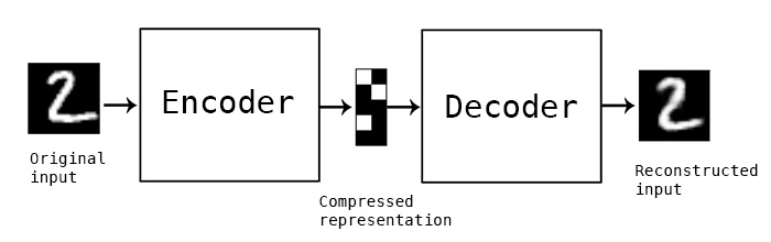
In this simple example, and autoencoder and decoder can be thought of as squishing the input image down to a compressed encoding, then reconstructing it to the original size (decoding). The reconstruction will not be perfect, but the difference between the input and output will be minimized in training. (Source)

Data processing

In this post I’m going to be using exclusively simulated 3D structures. Each structure starts as 64 ordered 3D points, an 64×3 matrix with x,y,z coordinates. Calculating the pairwise distance between all points gives a 64×64 distance matrix. The matrix is normalized to be in [0-1]. The matrix is also symmetric and has a diagonal of zero by definition. I used ten thousand structures simulated with the molecular dynamics pipeline, with an attempt to pick independent draws from the MD simulation. The data was split 80/20 between training and

Model architecture

For the clustering autoencoder, the goal is to reduce dimensionality as much as possible while still retaining good input information. We will accept modest loss for a significant reduction in dimensionality. I used 4 convolutional layers with 2×2 max pooling between layers. The final encoding layer was a dense layer. The decoder is essentially the inverse, with upscaling layers instead of max pooling. I implemented this model in python using Keras with the Theano backend.

Dealing with distance map properties

The 2D distance maps I’m working with are symmetric and have a diagonal of zero. First, I tried to learn these properties through a custom regression loss function, minimizing the distance between a point i,j and its pair j,i for example. This proved to be too cumbersome, so I simply freed the model from learning these properties by using custom layers. Details of the implementation are below, because they took me a while to figure out! One custom layer sets the diagonal to zero at the end of the decoding step, the other averages the upper and lower triangle of the matrix to enforce symmetry.

Clustering single-cell chromatin structure data

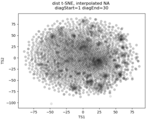
No real clustering here…

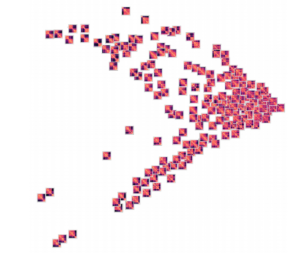
In the past I’ve attempted to visualize and cluster single-cell chromatin structure data. Pretty much any way I tried, on simulated and true experimental data, resulted the “cloud” – no real variation captured by the axes. In this t-SNE plot from simulated 3D structures collapsed to 2D maps, you can see some regions of higher density, but no true clusters emerging. The output layer of the autoencoder ideally contains much of the information in the original image, at a much reduced size. By clustering this output, we will hopefully capture more meaningful variation and better discrete grouping.


Groupings of similar folding in the 3D structure!

Here are the results of clustering the reduced dimensionality representations learned by the autoencoder. I’m using the PHATE method here, which seems especially applicable if chromatin is thought to have the ability to diffuse through a set of states. Each point is represented by the decoded output in this map. You can see images with similar structure, blocks that look like topologically associated domains, start to group together, indicating similarities in the input. There’s still much work to be done here, and I don’t think clear clusters would emerge even with perfect data – the space of 3D structures is just too continuous.

Denoising and inpainting

I am particularly surprised and impressed with the usage of deep learning for image superresolution and image inpainting. The results of some of the state of the art research are shocking – the network is able to increase the resolution of a blurred image almost to original quality, or find pixels that match a scene when the information is totally absent.

With these ideas in mind, I thought I could use a similar approach to reduce noise and “inpaint” missing data in simulated chromatin structures. These tasks also use an autoencoder/decoder architecture, but I don’t care about the size of the latent space representation so the model can be much larger. In experimental data obtained from high-powered fluorescence microscope, some points are outliers: they appear far away from the rest of the structure and indicate something went wrong with hybridization of fluorescence probes to chromatin or the spot fitting algorithm. Some points are entirely missed, when condensed to a 2D map these show up as entire rows and columns of missing data.
To train a model to solve these tasks, I artificially created noise or missing data in the simulated structures. Then the autoencoder/decoder was trained to predict the original, unperturbed distance matrix.

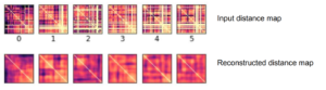
Here’s an example result. As you can see, the large scale features of the distance map are recovered, but the map remains noisy and undefined. Clearly the model is learning something, but it can’t perfectly predict the input distance map

Conclusions

By transferring a problem of 3D points to a problem of 2D distance matrices, I was able to use established deep learning techniques to work on single-cell chromatin structure data. Here I only showed simulated structures, because the experimental data is still unpublished! Using an autoencoder/decoder mode, we were able to better cluster distance maps into groups that represent shared structures in 3D. We were also able to achieve moderate denoising and inpainting with an autoencoder.

If I was going to continue this work further, there’s a few areas I would focus on:

  • Deep learning on 3D structures themselves. This has been used in protein structure prediction [ref]. You can also use a voxel representation, where each voxel can be occupied or unoccupied by a point. My friend Eli Draizen is working on a similar problem.
  • Can you train a model on simulated data, where you have effectively infinite sample size and can control properties like noise, and then apply it to real-world experimental data?
  • By working exclusively with 2D images we lose a lot of information about the input structure. For example the output distance maps don’t have to obey the triangle inequality. We could use a method like Multi-Dimensional Scaling to get a 3D structure from an outputted 2D distance map, then compute distances again, and use this in the loss function.

Overall, though this was an interesting project and a great way to learn about implementing a deep learning model in Keras!


Simulating 3D chromatin structure with molecular dynamics and loop extrusion

Much of the current evidence for the loop extrusion hypothesis comes from molecular dynamics simulations. In these simulations, DNA is modeled as a polymer, loop extruding factors with certain parameters are added into the mix, and the polymer is allowed to move around as if it were in a solvent. By running the simulation for a long time and saving conformations of the polymer at defined intervals, you can gather an ensemble of structures that represent how chromatin might be organized in a population of cells. Note that molecular dynamics is much different than MCMC approaches to simulating chromatin structure – here we’re actually simulating how a chromatin might behave due to physical and chemical properties.

In this post, I’m going to show you how you can run these molecular dynamics simulations for yourself. The simulations rely on the OpenMM molecular simulation package, the Mirnylab implementation of openmm-polymer and my own scripts and modification of the mirnylab code.

Ingredients

  • Install the required packages. See the links above for required code repositories. Note that it can be quite difficult to get openmm-polymer configured properly, so good luck…
  • Simulation is much quicker using a GPU
  • Pick your favorite chromatin region to simulate. In this example, we’re going to use a small region on chromosome 21.
  • Define CTCF sites, including orientation and strength. These will be used as blocking elements in the simulation. The standard is to take CTCF binding ChIP-Seq data for your cell type of interest, overlap the peaks with another track too add confidence and determine orientation (such as CTCF motifs in the genetic code or RAD21 binding data).
  • Define other parameters for the simulation, such as the time step and number of blocks to save. These can be found in the help text for the simulation script.

Check your parameters

Before running a time consuming 3D polymer simulation, you can run simple test to see how the extruding factors are behaving in the simulation. This 2D map gives the probability of an extruder binding two sites along the linear genome, and is a good prediction for how the mean 3D structure will look. Briefly, there’s a logistic scaling function that transforms an arbitrary ChIP-Seq peak strength into a 0.0-1.0 interval. The scaled strength of the each site defines the probability that a LEF can slip past the site without stalling. Even though CTCF might form an impermiable boundary in reality, modeling this with a probability makes sense because we’re generating an ensemble of structures. You might need to tune the parameters of the function to get peak strengths to make sense for your ChIP-Seq data.

Loop extruder occupancy matrix. This gives the log transformed probability of a LEF binding two locations along the genome. CTCF sites for the example region of interest are shown above, with the color indicating directionality and height indicating strength. Notice how we already start to see domain-like structures!

Running the simulation

With all the above ingredients and parameters configured, it’s time to actually run the simulation. Here we will run for a short number of time steps, but you should actually let the simulation run for much longer to gather thousands of independent draws from the distribution of structures.

Using the code available at my github, run the loop_extrusion_simulation.py script. Here is an example using the data available in the repository

cd openmm-dna
python src/loop_extrusion_simulation.py -i data/example_ctcf_sites.txt -o ~/loop_extrusion_test --time_step 5000  --skip_start 100 --save_blocks 1000

Some explanation of the parameters: time_step defines how many steps of simulation are done between saving structures, skip_start makes the script skip outputting the first 100 structures to get away from the initial conformation, save_blocks means we will save 1000 structures total. There are many other arguments to the script, check the help text for more. In particular, the –cpu_simulation flag can be used if you don’t have a GPU.

If everything is configured correctly, you’ll see output with statistics on the properties of each block.

potential energy is 3.209405
bl=1 pos[1]=[10.9 14.2 5.8] dr=1.46 t=8.0ps kin=2.39 pot=2.24 Rg=9.084 SPS=235
Number of exceptions: 3899
adding force HarmonicBondForce 0
adding force AngleForce 1
Add exclusions for Nonbonded force
Using periodic boundary conditions!!!!
adding force Nonbonded 2
Positions...
loaded!
potential energy is 2.354693
bl=2 pos[1]=[11.4 14.1 6.0] dr=1.21 t=8.0ps kin=1.78 pot=2.09 Rg=9.278 SPS=333
...

Processing simulated structures

After simulation, I process the raw structures by trimming the ends (by the same amount of the –extend argument) and binning the points by taking the 3D centroid to reduce the resolution. As I’m trying to match experimental data with this simulation, I reduce the resolution to the same as the experimental data. Then I save the ensemble in a numpy array, which is much quicker to load for subsequent analysis. There’s a script to do this:

python src/process_simulated_structures.py -i ~/loop_extrusion_test -o ~/loop_extrusion_test/processed

Analysis of results

There are a few ways you can analyze the results after the simulation has finished. The obvious first step is to create an average contact map from the ensemble of structures. This plot is the most comparable to a Hi-C dataset.

Simulation contact probability at radius of 10. 1000 structures went into this plot.

Hi-C contact frequency for the same region in K562 cells. A great qualitative match, inluding domains and peaks!


Another common way to look at chromatin structure data is plotting contact probability as a function of genomic distance. This function is expected to decrease linearly on a log-log plot, with the slope giving evidence for mechanism for packing the underlying structures. You can look at the radius of the structures, how they cluster, and many other metrics. More on this to come later!

Is loop extrusion responsible for the 3D structure of the genome?

3D genome organization shapes genetics at all scales. Source: Nature 3D Genome Collection

It’s generally accepted biological knowledge that chromatin is organized in a complex and tightly-regulated manner inside the cellular nucleus. High-throughput chromatin conformation capture (Hi-C), microscopy experiments and computer simulations have added much to our knowledge of chromatin’s three dimensional organization. However, there still isn’t a consensus on the molecular mechanisms actually responsible for such organization!

A major advance in the past few years was the formalization of the loop extrusion hypothesis. Loop extrusion explains many features of experimental data – and I’m going to describe it in detail soon. However, we still don’t have conclusive mechanistic evidence that it is actually happening inside the nucleus. New research is continually adding to the body of evidence for the hypothesis, though, so it looks like loop extrusion is here to stay.

Loop extrusion, explained

Loop extrusion dynamics. Extruders are shown as linked pairs of yellow circles, chromatin fiber shown in gray. From top to bottom: extrusion, dissociation, association, stalling upon encountering a neighboring extrusion comples, stalling at a blocking element (red hexagon). Taken from Figure 2 of [1]

Chromatin in the nucleus of the cell is organized in an incredibly robust and precise way. Over 2m of linear DNA has to fit into the nucleus, around 10µm in diameter. Each chromosome has to be faithfully replicated every time the cell divides, chromatin has to be “opened” and “closed” in response to external signals, and transcriptional machinery has to be able to access each gene to express mRNA and produce proteins. Past research has shown that the genome is organized at different levels (compartments, domains, sub-domains), and contains “peaks” of increased 3D interaction at specifically defined loci, often between binding sites for the transcription factor CTCF. Any mechanistic model for chromatin organization needs to take all of these factors into account.

Loop extrusion considers the action of extruding factors – most likely the proteins cohesin or condensin. Extruding factors are typically thought of as pairs of proteins with a fixed linker between them. They bind DNA and each member of the pair translocates along the polymer, effectively extruding a loop. Unhindered, an extrusion complex will process along the DNA until it dissociates. If an extrusion complex encounters another, both will stall at that position on the DNA. The model also considers blockers – most likely bound CTCF – that can stall extrusion complexes. Blockers are modeled to be directional (they only block extruders moving in one direction) and semi-permeable (they let an extruder pass with a certain probability). For a video explaining the action of loop extrusion, see this post.

Loop extrusion provides a simple unifying principle to explain 3D genome structure. Initially, the best evidence for this hypothesis came from simulation using molecular dynamics – simulating the action of loop extrusion complexes on a polymer constructed to mimic DNA. By placing blocking sites at locations where CTCF was bound in the genome, these simulations closely reconstructed experimental Hi-C data. In addition, loop extrusion can explain what Hi-C contact maps look like after removing CTCF binding sites with CRSIPR genome editing.

There’s a interesting history of the loop extrusion hypothesis – it’s actually not a completely novel idea for explaining genome architecture. A report in 1990 by Arthur Riggs [3] proposed “DNA reeling.” Then, Kim Nasmyth mentioned that an extrusion-like mechanism might play a role in separating sister chromatids  and genome organization in 2001 [4]. However, the idea was buried in a 75 page article. Nasmyth even discouraged the idea, “I give this example not so much because it is a serious candidate for the function of condensin (or cohesin for that matter) but rather because it illustrates the notion that condensin or molecules like it could have a very active role in folding and resolving chromatids.” As far as I can tell, loop extrusion went untouched until a publication by Alipour and Marko in 2012 [5], who proposed an extrusion-like mechanism could be used to compact mitotic chromosomes. Then, concurrent publications by the Mirny and Lieberman Aiden groups formalized the idea [1,2]. The timing of these publications was interesting – a preprint of one came out while the other was in review. However, the authors maintain that the ideas were developed independently.

Loop extrusion is a convincing hypothesis, but mechanistic explanation for it actually happening in the genome is lacking. A few recent publications have begun to address this, defining the proteins that are responsible and the parameters that govern their action. For example, Ganji et. al. [6] used single molecule imaging to visualize that condensin from S. cerevisiae could form loops on DNA, at a rate of up to 1500 bp/s. “Here, we provide unambiguous evidence for loop extrusion by directly visualizing the formation and processive extension of DNA loops by yeast condensin in real-time.”

Further biophysical experiments will likely give us more confidence about loop extrusion. In particular, evidence in human cells with human cohesin/condensin is lacking.

References

1. Fudenberg, G. et al. Formation of Chromosomal Domains by Loop Extrusion. Cell Reports 15, 2038–2049 (2016).
2. Sanborn, A. L. et al. Chromatin extrusion explains key features of loop and domain formation in wild-type and engineered genomes. PNAS 201518552 (2015).
3. Riggs, A. D. DNA methylation and late replication probably aid cell memory, and type I DNA reeling could aid chromosome folding and enhancer function. Phil. Trans. R. Soc. Lond. B 326, 285–297 (1990).
4. Nasmyth, K. Disseminating the Genome: Joining, Resolving, and Separating Sister Chromatids During Mitosis and Meiosis. Annual Review of Genetics 35, 673–745 (2001).
5. Alipour, E. & Marko, J. F. Self-organization of domain structures by DNA-loop-extruding enzymes. Nucleic Acids Res 40, 11202–11212 (2012).
6. Ganji, M. et al. Real-time imaging of DNA loop extrusion by condensin. Science eaar7831 (2018). doi:10.1126/science.aar7831

ISCB Student Council Symposium 2017

Each year, the International Society for Computational Biology Student Council (ISCB-SC) organizes a conference for students and early career scientists in computational biology. The Student Council Symposium (SCS) is typically the day before the Intelligent Systems for Molecular Biology conference and welcomes scientists from all over the world. As one of the organizers of SCS this year, I had to be in Prague to administer the conference and deal with last-minute . Check out these links if you’re interested in the Student Council (twitter), or want to read some writing I’ve done on planning an international conference in the past.

We had 3 excellent keynotes this year:

  • Dr. Christine Orengo, professor at UCL and protein structure expert. Dr. Orengo gave an overview of her research, but spent most of the time speaking about advice for young scientists. A major point she stressed was to carve out your own niche in the research world. Find an area that combines what you’re good at, what interests you, and where the field isn’t too crowded. There, you can maximize the impact of your work and can be the most successful without excessive competition. Dr. Orengo also spoke about how important good relationships with your competitors are. I took this away from the lecture, “keep your collaborators close, but keep your competitors closer.” Not to compare scientific research to The Godfather, but the point was that you should treat your competitors well. You can learn from them, be motivated by them, and might even end up joining forces in the end!
  • Dr. Johannes Söeding, professor at the Max Planck Institute for Biophysical Chemistry and another protein sequence, structure and homology expert. His lecture was more focused on research his team had been doing. Quite successfully, I might add, as we had two of his students presenting at SCS!
  • Fiona Nielsen, founder and CEO of Reopositive. Fiona talked about her transition from academia to private industry. Deep in the research process, she found it almost impossible to identify or access datasets that would support her project. It’s a problem I’ve seen over and over again in my own research: there are many databases of genotyping or gene expression data, each with their own datasets, formats and access rules. After identifying the data you need, it can take months to be approved if the dataset has restricted access (for patient sensitive information or germline mutation status). Majorly frustrated by these repetitive roadblocks, Fiona was driven to solve this problem. She first established a charity (DNAdigest) and then a company (Repositve). It was interesting to hear Fiona’s take on this winding career path, and helpful to be reminded that pure research isn’t the only path that can have a positive impact on patients.

Another highlight of this year was the flash presentations: 5 minutes, 2 slides and 1 chance to sell your work to the crowd. Flash presentations gave many more people a chance to speak – we had 12 this year. I was worried that keeping people to the 5 minute time limit would be difficult, but everyone stayed on track and they were a big success. We’ll definitely have more flash presentations at future SCS.

This was also the largest SCS I’ve ever attended or organized — we had 75 poster presentations and even more people registered for the symposium! I enjoyed helping to organize an event that brought people from such diverse and far-reaching backgrounds together. A lot of time and effort goes into SCS, but it’s rewarding and worth it in the end.

Finally, we moved the crowd to a nearby restaurant and bar for the “networking event,” which is a chance to let off some steam and enjoy a good meal while avoiding the topic of research entirely. It was great fun, even if Bart did hog all the beer!

A huge thanks to the other SCS organizers, it takes a big team effort to pull off an event like this: Julien Fumey, Mehedi Hassan, Bart Cuypers, Aishwarya Alex Namasivayam, Nazeefa Fatima, Alexander Monzon, Farzana Rahman, Sayane Shome, Dan DeBlasio, R. Gonzalo Parra and Alex Salazar all made invaluable contributions and were a pleasure to work with.

ISCB student council 2014

I submitted some research I’ve been working on (as a byproduct of TAing a first year seminar and leading some students in an independent bioinformatics project) to the International Society for Computational Biology student council symposium. Yesterday I found out it was selected for an oral presentation! This is the first chance I’ve had to present independent research, so needless to say I’m pretty excited.

The talk is titled “Tetranucleotide usage in mycobacteriophage genomes: alignment-free methods to cluster phage and infer evolutionary relationships” Read on for the full abstract.

Continue reading

k-mers are everywhere!

Many problems in bioinformatics involve working with short pieces of DNA sequence. We call these short words k-mers, where k is an integer usually less than 30 or so. A k-mer is essentially a substring of a larger sequence of DNA. If you’re  a biologist you may be wondering why people could be interested in anything other than 3-mers, the codons that encode amino acids. As it turns out, k-mers are at the center of many bioinformatics techniques and are the subject of intense algorithms research.

Some bioinformatics areas where k-mers play a central role:

  • Genome Assembly. Assemblers based on the overlap-consensus model (such as Celera) or De Bruijn Graphs (like Velvet) use k-mers to build the initial data structure for genome assembly. As overlaps between k-mers are found, the assembled sequence grows!
  • Sequence Alignment. The Basic Local Alignment Search Tool, or BLAST, is arguably the most well-known product of the bioinformatics field. BLAST can find DNA sequences conserved between organisms, uncover horizontal gene transfer and explain why we can’t make a vaccine for the common cold. And it all depends on the initial matching of short k-mers from the search sequence to the database.
  • Sequencing Quality Control. Overrepresentation of k-mers in a next gen sequencing library can be diagnostic for errors and duplications. The fastqc program computes the usage of 5-mers in sequencing reads as a form of quality control.
  • Alignment-Free sequence Analysis. My new favorite problem! Expect a post on this soon. Basically, the usage of short k-mers in a genome can be used to infer evolutionary relationships and examine horizontal gene transfer. Kind of like GC content but with more signal.
  • Codons and Repetitive Regions. Codons, the 3-letter sequences that encode for amino acids that build proteins, are essentially 3-mers with special biological function. 3-mers are also important in disease, such as the CAG repeats that cause Huntington’s disease.

K-mers are everywhere in bioinformatics. There is a lot of work into ways to efficiently (computational time and memory) count k-mers in large genomes. Really impressive and cool algorithms have been developed to solve the k-mer counting problem, some of which I’ll be talking about in a later post. It turns out these little words of DNA are important after all!